For our next assignment you will be creating digital illustrations for the Toronto Police Services recruiting program. Our clients will be providing feedback at various stages. The best designs and illustrations will go live on their instagram page.
You will need to complete an initial series of brainstorm sketches, based on your research at the Toronto Police Services website and their instagram page.
The client has provided the following information regarding their communication needs:
1.) "One Career, Many Opportunities" is our tagline. It should be incorporated in some interesting, creative way into your design(s)
2.) The format of each piece is to be square, for use on Instagram. Additionally, there may be potential reuse for print (possibly posters?) so we will deliver 300 dpi print-ready files rather than just 72 dpi web-ready files. When designing your thumbnails, consider that the image area might need to be modified to a vertical rectangle (poster) format and plan for that eventuality.
3.) Diversity is essential. Portray different races and genders, but also different ages and differently abled people
4.) The priority careers we should illustrate are police constables, parking enforcement officers, district special constables and communication operators.
You will find photo reference of uniforms by researching the Toronto Police Service's instagram page (see link above). You can also use Google Image Search.
5.) Our clients are open to seeing any and all concepts you can come up with and have no specific art direction regarding imagery/concepts they'd like to see.
Some important considerations as you begin your brainstorming sketches: illustration is not photography. Think of ways to differentiate your artwork from what could just as easily be photographed. Think about stylization, design and composition, non-literal colour, montage and conceptual approaches.
Thumbnailing
As always, we will go through three preparatory steps as with any project : Brainstorms Sketches > Thumbnail Sketches > Comp Sketch.
We can't go to a comp sketch until the client has had a look at your thumbnail concepts, so the thumbnails will need to be quite comprehensive as well.
They should have values indicated in grey scale. The type should be either very well sketched or placed digitally.
They can be any size/res as long as they are square and aren't pixelated when viewed on screen.
Please add your thumbnail sketches to your blog post, below the brainstorm sketches
Tuesday, February 25, 2020
Sunday, April 8, 2018
ISA #2: Create a six frame full colour storyboard
For this next assignment you will digitally storyboard a (minimum of) six frame sequence of your own choosing. You are very welcome to create a storyboard longer than six frames.
You have the option to:
1.) write your own script - any subject is fine so long as it involves 'live action' human-proportioned characters. Cartoony characters will not be acceptable.
OR
2.) choose a sequence from a favourite book, film, video game cut scene or TV show - so long as it involves 'live action' human-proportioned characters. NOTE: If you choose an existing film, video game or TV show sequence, it is OK to use screen grabs as 'photo reference.'
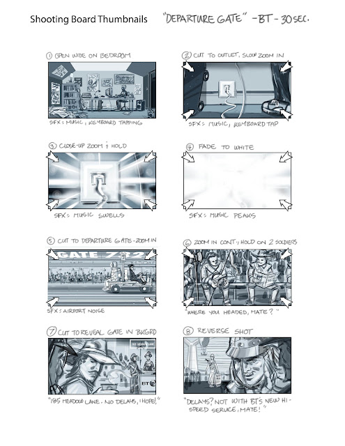
Whether you choose option 1 or 2, your initial presentation on your next blog entry should be a b/w thumbnail version of your board. Some years ago I used to do what's known as "shooting boards" for a British TV commercial director named John O'Hagan. Below is a series of sketches John did for me at the start of one of our projects, for a TV commercial he was going to shoot for British Telecom (BT).
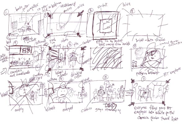
Start your sketching process by creating a similar roughly sketched board (including hand written director's notes), using John's example as your guide. Post this sequence on your blog, explaining what you are working on.
Next, using digital drawing and painting techniques to show both line art and shading in grey scale, create a more developed version of the initial thumbnails, like the first page of this sequence I sketched for John after looking at his rough sketches.
Use the three hours we would normally be in class tonight to do your initial stick figure thumbnail board, then spend the week resketching the sequence as per my example.
Post both sequences on your blog, along with some written description of your process by the start of our class in Week Nine. Upload the link to your post to the Week09 dropbox.
You have the option to:
1.) write your own script - any subject is fine so long as it involves 'live action' human-proportioned characters. Cartoony characters will not be acceptable.
OR
2.) choose a sequence from a favourite book, film, video game cut scene or TV show - so long as it involves 'live action' human-proportioned characters. NOTE: If you choose an existing film, video game or TV show sequence, it is OK to use screen grabs as 'photo reference.'
Whether you choose option 1 or 2, your initial presentation on your next blog entry should be a b/w thumbnail version of your board. Some years ago I used to do what's known as "shooting boards" for a British TV commercial director named John O'Hagan. Below is a series of sketches John did for me at the start of one of our projects, for a TV commercial he was going to shoot for British Telecom (BT).
Start your sketching process by creating a similar roughly sketched board (including hand written director's notes), using John's example as your guide. Post this sequence on your blog, explaining what you are working on.
Next, using digital drawing and painting techniques to show both line art and shading in grey scale, create a more developed version of the initial thumbnails, like the first page of this sequence I sketched for John after looking at his rough sketches.

Use the three hours we would normally be in class tonight to do your initial stick figure thumbnail board, then spend the week resketching the sequence as per my example.
Post both sequences on your blog, along with some written description of your process by the start of our class in Week Nine. Upload the link to your post to the Week09 dropbox.
Tuesday, April 3, 2018
Storyboarding a TV Commercial, Part 4
Last time you digitally sketched thumbnails based on the revised script. You would have begun with a series of linear drawings (of thumbnail quality) and added grey values afterwards. Based on my recent demo in class, redo your thumbnails using a grey tones painting process, blocking in shapes rather than focusing on linear details. For example:
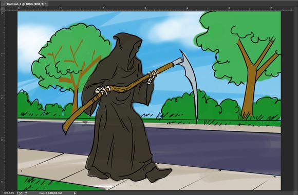
Now use these 'painted' thumbnails to begin building the full colour final version. Choose any one frame that appeals to you and block in the biggest shapes in colour, working from back to front. Leave the thumbnail on a Multiply payer with reduced opacity to help guide your colour block-in:
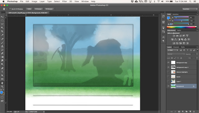
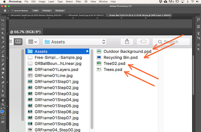
Add assets like trees and other mid-ground props on separate layers so you have the flexibility to move them around, lighten or darken them, duplicate them or resize them.

You can save these as separate files for later use on other frames - or even other future jobs.
Add a Multiply layer for shading foreground elements...
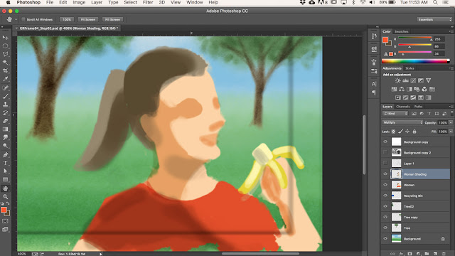
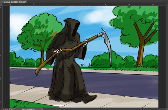
... followed by additional layers for details like facial features and clothing details, and then finally a highlights layer.
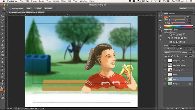
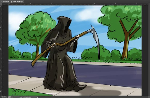
As a finishing touch I gathered together the mid-ground layers (trees, Grim, and the recycling bin) and applied a Gaussian Blur filter to them. This heightens the sense of 'film making' - suggesting the scene was shot with a short focus lens.
For next week, choose just ONE frame from your painted thumbnail sequence and use this method to paint the full colour finished version. Post screen shot steps, explaining your process as you go - just as I've done above. Include your Photoshop desktop as you can see in my shots.

Now use these 'painted' thumbnails to begin building the full colour final version. Choose any one frame that appeals to you and block in the biggest shapes in colour, working from back to front. Leave the thumbnail on a Multiply payer with reduced opacity to help guide your colour block-in:

Add assets like trees and other mid-ground props on separate layers so you have the flexibility to move them around, lighten or darken them, duplicate them or resize them.

You can save these as separate files for later use on other frames - or even other future jobs.

Add a Multiply layer for shading foreground elements...

... followed by additional layers for details like facial features and clothing details, and then finally a highlights layer.

As a finishing touch I gathered together the mid-ground layers (trees, Grim, and the recycling bin) and applied a Gaussian Blur filter to them. This heightens the sense of 'film making' - suggesting the scene was shot with a short focus lens.
For next week, choose just ONE frame from your painted thumbnail sequence and use this method to paint the full colour finished version. Post screen shot steps, explaining your process as you go - just as I've done above. Include your Photoshop desktop as you can see in my shots.
Tuesday, March 20, 2018
Storyboarding a TV Commercial, Part 3
Sometimes there are client changes.
In this case, the client liked the general idea of the Grim Reaper slipping on a banana peal, but felt there wasn't enough emphasis on healthy living. The human factor was missing. So the creative team came up with a new scenario, which would require a new storyboard for a second client presentation.
For next week: Read the script, then create a new thumbnail storyboard. Like last time, use a storyboard template and include grey scale values in all your thumbnails.
REVISED SCRIPT
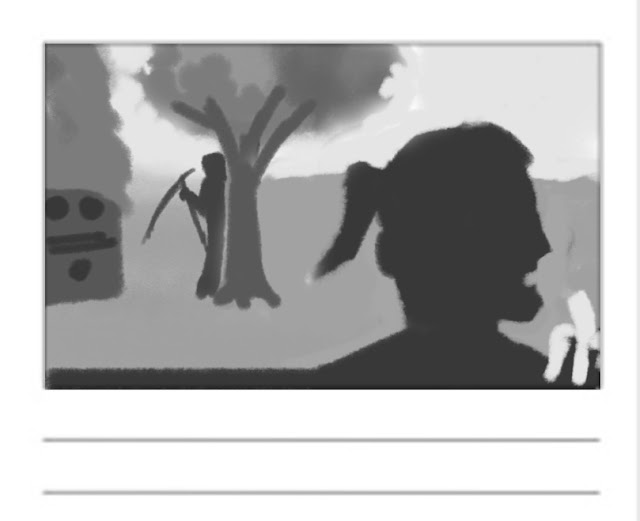
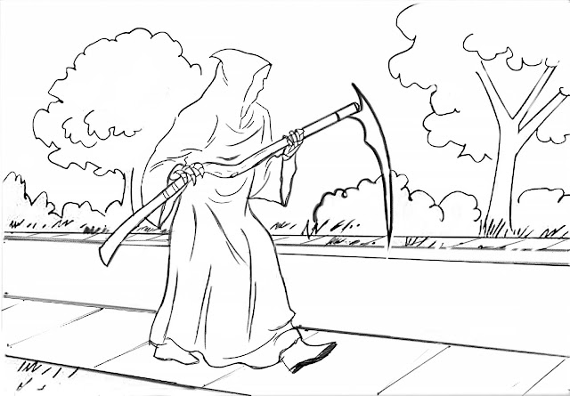
Frame 1: Grim is hiding behind a tree at the park. Camera is behind him looking with him toward a park bench. Someone is sitting on the bench with their back to camera.
Frame 2: Reverse angle - camera is in front of bench, close up on slightly overweight, middle-aged woman in work out clothing. she is happy, eating a banana. Over her shoulder we can see the tree with Grim peaking out from behind the trunk.
Frame 3: Grim begins to creep toward woman.
Frame 4: Woman, oblivious to Grim's approach, tosses banana peel over her shoulder.
Frame 5: CU (close up) on flying banana peel.
Frame 6: Grim wipes out on the banana peel.
Frame 7: In foreground we see a dazed Grim propped up on one elbow, the banana peel on the grass nearby. Further in the distance, the middle-aged woman jogs away, still oblivious.
Frame 8: Quick cut to a hand, finger extended, pressing the ON button on a blender. A fruit smoothy swirls inside the glass pitcher section of the blender.
Frame 9: Quick cut to a hand reaching into frame to pick up a pair of running shoes.
Frame 10: Text screen: Headline: Move It or Lose It Logo: Participaction (you can find the logo here: https://www.participaction.com/en-ca ) Footer: Visit participaction.com
In this case, the client liked the general idea of the Grim Reaper slipping on a banana peal, but felt there wasn't enough emphasis on healthy living. The human factor was missing. So the creative team came up with a new scenario, which would require a new storyboard for a second client presentation.
For next week: Read the script, then create a new thumbnail storyboard. Like last time, use a storyboard template and include grey scale values in all your thumbnails.
REVISED SCRIPT
Frame 1: Grim is hiding behind a tree at the park. Camera is behind him looking with him toward a park bench. Someone is sitting on the bench with their back to camera.
Frame 2: Reverse angle - camera is in front of bench, close up on slightly overweight, middle-aged woman in work out clothing. she is happy, eating a banana. Over her shoulder we can see the tree with Grim peaking out from behind the trunk.
Frame 3: Grim begins to creep toward woman.
Frame 4: Woman, oblivious to Grim's approach, tosses banana peel over her shoulder.
Frame 5: CU (close up) on flying banana peel.
Frame 6: Grim wipes out on the banana peel.
Frame 7: In foreground we see a dazed Grim propped up on one elbow, the banana peel on the grass nearby. Further in the distance, the middle-aged woman jogs away, still oblivious.
Frame 8: Quick cut to a hand, finger extended, pressing the ON button on a blender. A fruit smoothy swirls inside the glass pitcher section of the blender.
Frame 9: Quick cut to a hand reaching into frame to pick up a pair of running shoes.
Frame 10: Text screen: Headline: Move It or Lose It Logo: Participaction (you can find the logo here: https://www.participaction.com/en-ca ) Footer: Visit participaction.com
Wednesday, March 14, 2018
Storyboarding a TV Commercial, Part 2
Once you've digitally 'inked' your line art version of the storyboard frames, make sure to turn off (or delete) any layers that contain the photo reference you used as part of your drawing process. What remains should be a clean line art (Multiply) layer directly above the Background layer:
Begin by flat colouring the background on the Background layer. Work from whatever is farthest away (the sky) to whatever is nearest (the road, sidewalk and grass in the foreground).
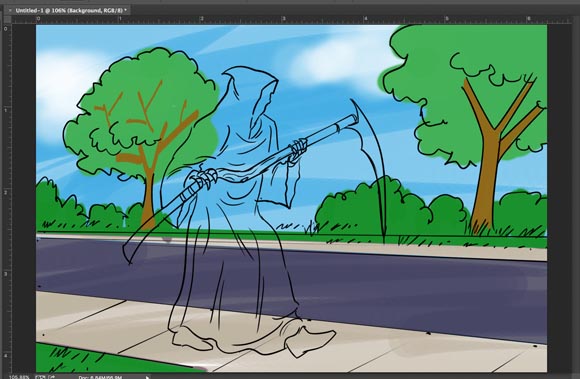
Flat colour the figure last by using the Polygon Lasso tool to select along the line art of the figure, as I demonstrated in class in Week Four.
Next, create a Multiply layer for the background and the figure. This layer will be the Shading layer, allowing you to add darker shadow shapes to both the figure and the background, which will heighten the sense of realism.
Next, create a Normal layer for the background and the figure. This layer will be the Highlight layer, allowing you to add lighter shapes to both the figure and the background, which will again heighten the sense of realism. Make sure to place the Highlights layer at the top of the layer stack.
For Week Six: Complete all four frames of your storyboard using the colouring process shown above. Post the stages of colouring on your blog (add this to the thumbnail post from week one of this assignment) - and describe what you did at each step of the process.

Begin by flat colouring the background on the Background layer. Work from whatever is farthest away (the sky) to whatever is nearest (the road, sidewalk and grass in the foreground).
Flat colour the figure last by using the Polygon Lasso tool to select along the line art of the figure, as I demonstrated in class in Week Four.
Next, create a Multiply layer for the background and the figure. This layer will be the Shading layer, allowing you to add darker shadow shapes to both the figure and the background, which will heighten the sense of realism.
Next, create a Normal layer for the background and the figure. This layer will be the Highlight layer, allowing you to add lighter shapes to both the figure and the background, which will again heighten the sense of realism. Make sure to place the Highlights layer at the top of the layer stack.

For Week Six: Complete all four frames of your storyboard using the colouring process shown above. Post the stages of colouring on your blog (add this to the thumbnail post from week one of this assignment) - and describe what you did at each step of the process.
Tuesday, March 6, 2018
Storyboarding a TV Commercial, Part 1
For our first Independent Study Assignment you will learn how to digitally draw and colour storyboard frames, then produce a four frame storyboard in full comprehensive colour based on this art director's script:
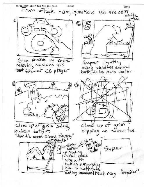
Before beginning your ISA storyboard, here is a practice exercise that will guide you step-by-step through the process of digitally drawing and then colouring another series of frames from the same campaign.
Step One is to thumbnail out the sequence of shots described in the script. You can find many examples of a storyboard template by using Google Image Search. Choose a basic one like this, download it and save it in a folder to use on each assignment.
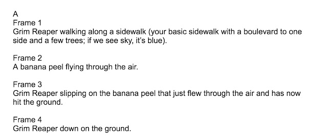
Here's an old script from a storyboard job I did some years ago. The client was the Ministry of Health for the Gov't of Saskatchewan. The premise for this commercial (and several others in the series) was that the Grim Reaper can't kill anyone who exercises and eats well. Read this script, then digitally thumbnail the four shots into the first four frames of your storyboard template.
Post your thumbnail storyboard sequence, which should look something like the example below, on your blog. You can see what other students in our class did by clicking the links in the right hand sidebar.
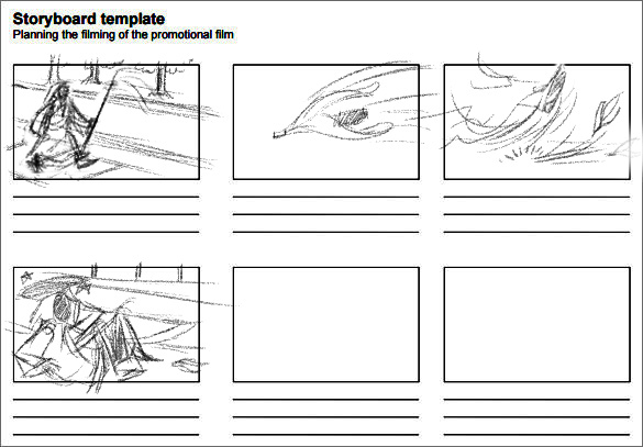
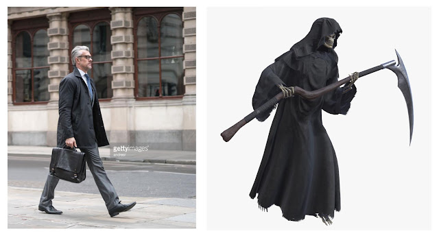
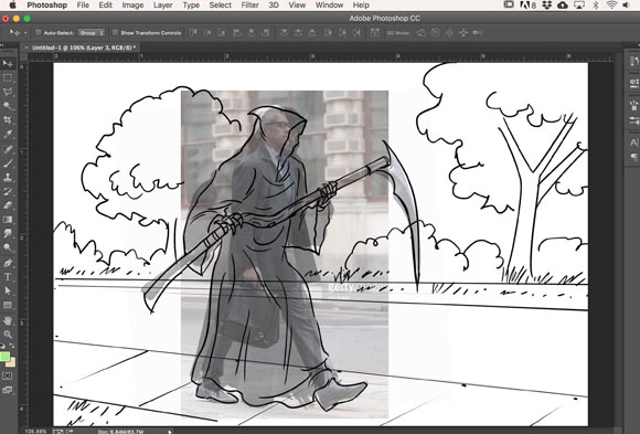
Once you've established your shots in thumbnail form, it's time to draw a better, final version of each frame. This commercial is meant to be shot with human actors, so the drawings can't look overly 'cartoony' - they need to reflect actual human proportions and somewhat realistic surroundings. If drawing realistically 'out of your head' is too challenging, find appropriate photo reference. For example, the opening shot of the Grim Reaper walking down the street would be easier to draw with the help of some photo reference like this:
By bringing these photo references into our document and combining them as a Multiply layer with reduced opacity, we can quickly 'ink' a linear version that is the correct (human) proportion, adding some relevant background environment as we go along. NOTE: keep the figure(s) and the background on separate layers for flexibility further on in the process!
Post your line art storyboard sequence on your blog below your thumbnails. Describe your process in a few sentences, explaining how you are working through the project. You can see what other students in our class did by clicking the links in the right hand sidebar of this blog.
Next week you'll be working independently on the colour stage of the four frame script (scroll back to the top to download that script). To see the colouring process step-by-step, click this link to the next blog post.

Before beginning your ISA storyboard, here is a practice exercise that will guide you step-by-step through the process of digitally drawing and then colouring another series of frames from the same campaign.
Step One is to thumbnail out the sequence of shots described in the script. You can find many examples of a storyboard template by using Google Image Search. Choose a basic one like this, download it and save it in a folder to use on each assignment.
Here's an old script from a storyboard job I did some years ago. The client was the Ministry of Health for the Gov't of Saskatchewan. The premise for this commercial (and several others in the series) was that the Grim Reaper can't kill anyone who exercises and eats well. Read this script, then digitally thumbnail the four shots into the first four frames of your storyboard template.

Post your thumbnail storyboard sequence, which should look something like the example below, on your blog. You can see what other students in our class did by clicking the links in the right hand sidebar.

Once you've established your shots in thumbnail form, it's time to draw a better, final version of each frame. This commercial is meant to be shot with human actors, so the drawings can't look overly 'cartoony' - they need to reflect actual human proportions and somewhat realistic surroundings. If drawing realistically 'out of your head' is too challenging, find appropriate photo reference. For example, the opening shot of the Grim Reaper walking down the street would be easier to draw with the help of some photo reference like this:

By bringing these photo references into our document and combining them as a Multiply layer with reduced opacity, we can quickly 'ink' a linear version that is the correct (human) proportion, adding some relevant background environment as we go along. NOTE: keep the figure(s) and the background on separate layers for flexibility further on in the process!
Post your line art storyboard sequence on your blog below your thumbnails. Describe your process in a few sentences, explaining how you are working through the project. You can see what other students in our class did by clicking the links in the right hand sidebar of this blog.
Next week you'll be working independently on the colour stage of the four frame script (scroll back to the top to download that script). To see the colouring process step-by-step, click this link to the next blog post.
Monday, April 3, 2017
Portrait Painting


Another good step-by-step demo by artist Aaron Coberly is at this link
You may want to try doing a painting in just greyscale (or choose a single colour and paint a monochromatic painting) as shown below.


Subscribe to:
Posts (Atom)